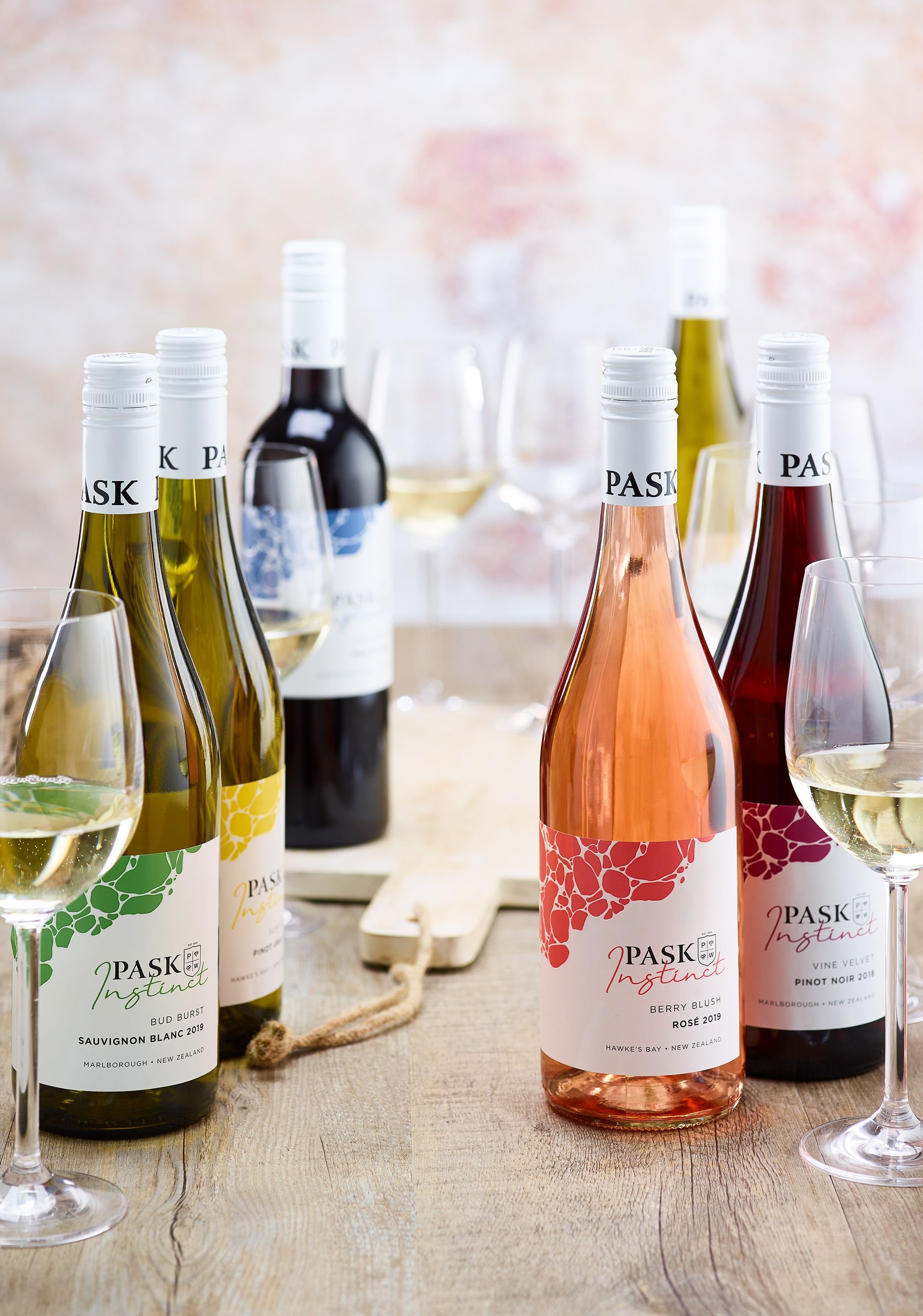
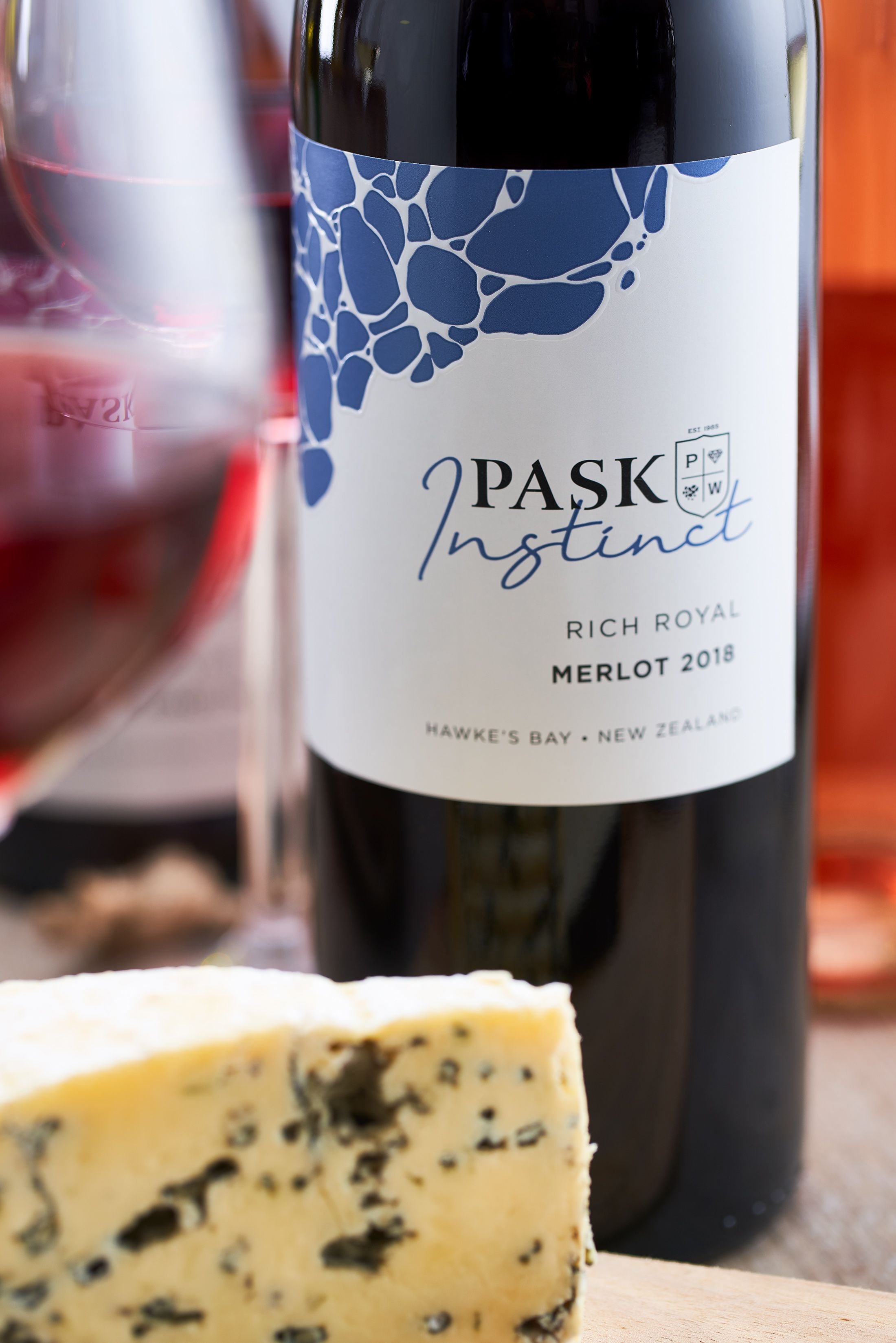
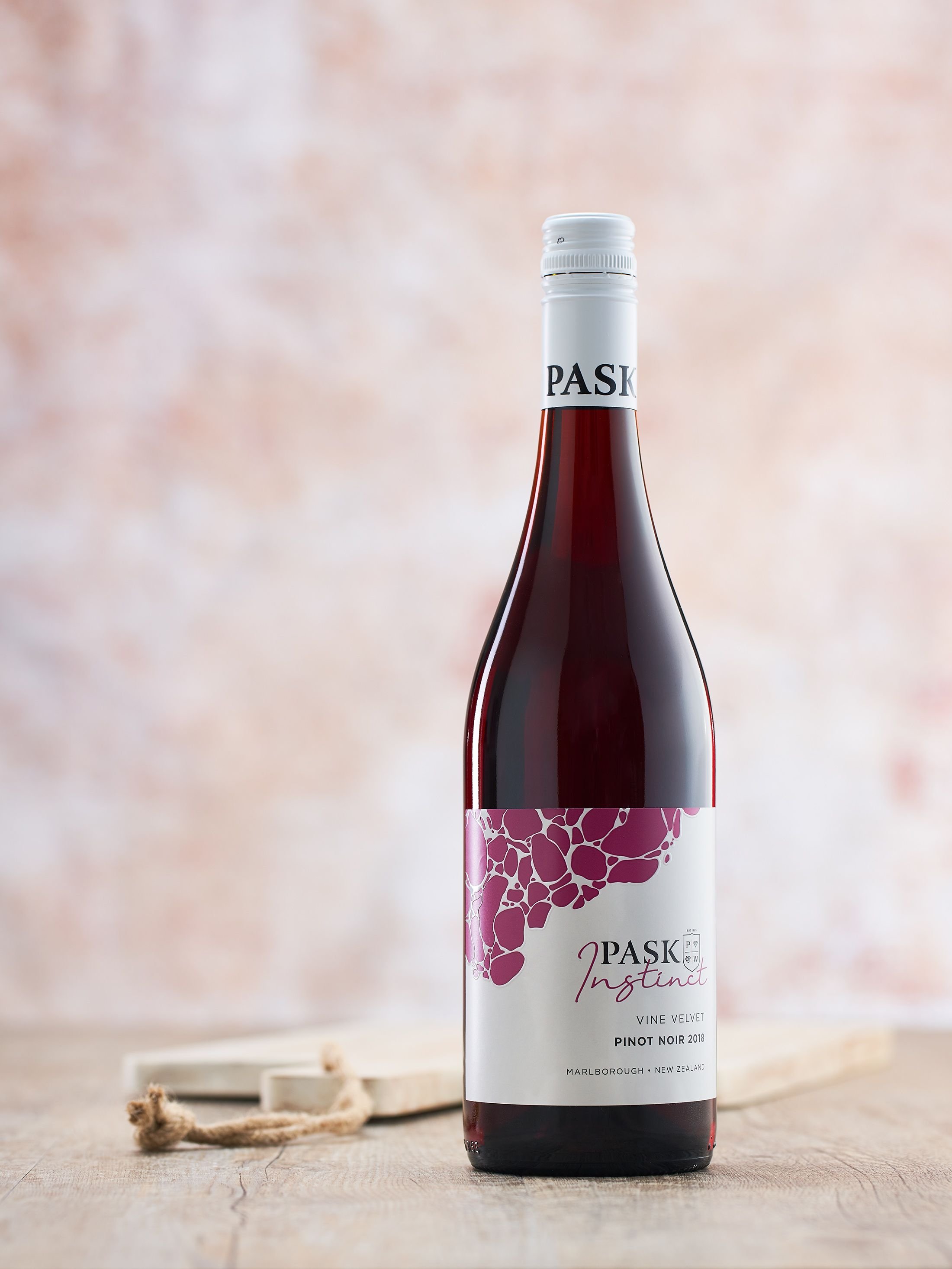
wine label: Pask instinct
The idea for Instinct was to merge 2 brands together, one bubbly and colourful while the other is strong and sophisticated.
a bit about the process
-

A white label to fit in with Pask's other labels that are already established. Aiming for this label to be recognisable as the Pask Brand but with colourfulness and fruity vibes. The stones are a coloured invert of what is on the other labels. Some of the wine names and colours have come over from an existing collection but have been left on this brand to keep the connection that this is the same wine, with different packaging.
-

I didn't have a lot of experience working with 3D packaging but I wanted to work with it somehow, eg: wrapping the stone image all the way around the box. Ended up getting a little complicated with lining the image up when the box is folded, so simplified the design. Colour matching the colours on the label to the boxes was difficult. Some of the colours overpowered the white in the logo whereas others just came out muddled and not as vibrant as the labels. This will be fixed through further orders. Definitely learned from this colour matching process.
-

I was fortunate enough to work on the factory line where the wine gets bottled and labelled before shipment. So I got to work with my label design and package it up before sending it off to bottle stores and overseas. A very cool experience.


